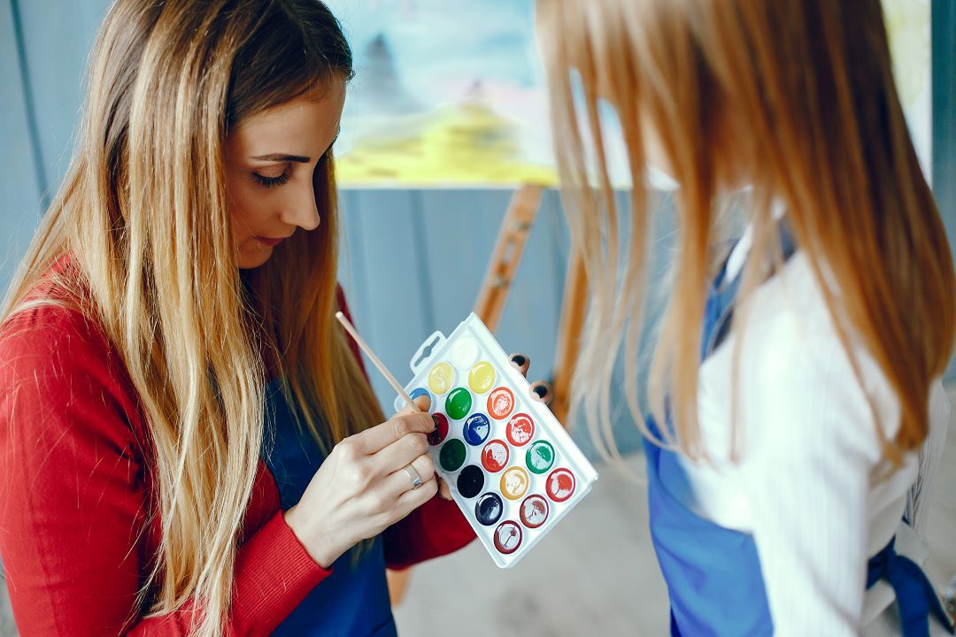

Mastering color theory is essential for creating stunning artwork in adult coloring classes.
This guide explores the foundations of color schemes, including primary, secondary, and tertiary colors, to build balanced and striking compositions.
It emphasizes the use of accent colors and effective color combinations to enhance visual appeal.
Understanding color harmony and high contrast helps in crafting dynamic designs, while selecting the right colour palette ensures cohesive and impactful results.
Understanding the Basics of Color Theory
Color theory is the study of how all colors interact and combine to create harmonious designs or visual effects.
Rooted in centuries of artistic exploration, the color wheel was first conceptualized by Sir Isaac Newton in the 17th century.
This colour theory art framework provides a systematic way to understand color combinations and relationships, laying the foundation for creating effective color schemes.
From accent colors to various shades, the historical evolution of color theory continues to influence modern artistic practices.

The color wheel is divided into primary colors (red, blue, yellow), which cannot be created by mixing other shades; secondary colors (green, orange, violet), formed by blending primary colors; and tertiary colors, created by mixing a primary color with a secondary one.
Understanding this hierarchy allows for the creation of cohesive color schemes, whether on a black background, a white background, or in projects emphasizing a dominant color.
Warm colors, such as red, orange, and yellow, evoke energy and vibrancy, while cool colors, including blue, green, and purple, promote calmness and relaxation.
Artists and designers use the contrast between warm and cool tones to strike the right balance in their work.
These color dynamics are fundamental in achieving the desired mood, especially when integrating accent colors in a composition or working with various shades and lighting conditions.

Exploring Color Harmony and Combinations
When it comes to achieving color harmony, understanding various color schemes is essential. Among these, complementary and analogous colors offer versatile ways to create visually engaging designs.
Complementary colors, located opposite each other on the color wheel, such as blue and orange, provide high contrast and vibrant energy to a composition.
On the other hand, analogous colors, which are neighbors on the color spectrum, such as green, blue-green, and blue, evoke a sense of cohesion and tranquility. Triadic and tetradic schemes add further depth to your color palette.
Triadic schemes use three colors evenly spaced on the color wheel, creating a balanced yet dynamic effect, while tetradic schemes involve two pairs of complementary colors, offering extensive variety and flexibility in accent colors.
For a more subdued approach, monochromatic schemes utilize varying shades, tints, and tones of a single color, like the color blue, to set a soothing and harmonious tone.
Color psychology/ colour psychology theory plays a vital role in creating mood and atmosphere with warm and cool colors.
Warm colors, such as reds and yellows, often inspire energy and passion, while cool colors, like blues and greens, promote calmness and relaxation.
By thoughtfully combining primary colors, secondary colors, and tertiary colors in your design, you can elicit specific psychological effects and emotional responses.
Whether you’re curating a color palette for personal projects or professional artwork, blending the principles of color harmony with an understanding of the psychological impact can result in a compelling and meaningful color scheme.

The Psychology of Colors
Colors play a powerful role in eliciting emotional responses and shaping perceptions. The study of color psychology reveals how different hues influence our feelings and behaviors, often through subconscious reactions.
For instance, warm colors like red, orange, and yellow are associated with energy, passion, and warmth, while cool colors such as blue, green, and purple tend to evoke calmness, serenity, and focus.
This interplay between warm and cool colors on the color wheel forms a foundational aspect of understanding how emotions are linked to shades across the color spectrum.
Cultural significance also plays a significant role in the meaning of colors. While the color blue might symbolically represent trust and stability in Western cultures, it could signify mourning or spirituality in other contexts.
Similarly, the use of accent colors or bold primary colors in a color palette can carry specific traditional or societal values, depending on the region.
This variation highlights the importance of considering cultural nuances when selecting a color scheme or creating visual elements.
Personal experiences and preferences add another layer of complexity when analyzing emotional responses to colors.
A secondary color combination/ colour combination of green and orange might evoke feelings of nostalgia for someone with a connection to nature, whereas others might find it stimulating or even overwhelming.
The mix of light and color within a specific environment, combined with tertiary colors and harmonious combinations, further affects individual perceptions.
By exploring how people interact with color schemes and their psychological effects, course participants can better tailor their choices to evoke desired emotions.

Practical Techniques for Applying Color Theory: Colour Wheel Theory
Shading and Blending
Mastering shading and blending is essential to creating depth and dimension in your artwork or designs.
By adjusting the intensity of warm and cool colors, you can emphasize contrast and create focus within a composition.
Using techniques such as layering or glazing allows you to seamlessly transition between shades, achieving a polished and harmonious color scheme.
For instance, blending an exact shade of blue with a neutral color, like gray, can soften its tone, creating interesting effects for the eye.
The color wheel serves as an invaluable guide in selecting harmonious color combinations for smoother blending and shading techniques.
Texture and Pattern with Colors
Integrating texture and patterns with colors provides an opportunity to add interest and energy to a design.
Warm colors, such as reds and oranges, are often used for bold, stimulating patterns, while cool colors, like blues, bring calming textures that balance the composition.
Carefully considering the interplay of color harmony and the tactile feel of textures allows for dynamic results.
Patterns in neutral colors combined with primary colors, for example, can create an engaging yet balanced arrangement.
Using these techniques thoughtfully ensures the chosen color scheme enhances the overall design or visual narrative.

Tips for Choosing the Right Colors
Selecting the right colors begins with identifying the purpose and mood of your design project.
Study the color wheel to explore effective color combinations and consider using complementary or analogous colors depending on your goals.
A calm design might utilize cool colors like blue and green, while warm colors add energy to more vibrant pieces.
When mixing light or working with digital platforms, be mindful of how colors translate across screens.
Always test combinations to ensure color harmony, and rely on neutral colors to temper bold choices.
This approach ensures your color scheme resonates both aesthetically and emotionally with the audience.
Balancing Color and White Space
Striking the right balance between color and white space is critical for cohesive visual communication.
White space allows colors to breathe, enhancing their impact without overwhelming viewers.
This becomes particularly important when working with multiple bold colors or intricate color schemes.
Using the right ratio of bright primary colors with neutrals can make a composition feel balanced and approachable.
Incorporating white space thoughtfully alongside warm and cool color tones ensures the design remains clean, legible, and visually appealing for a harmonious overall effect.

Advanced Topics in Color Theory
The Impact of Light and Shadow
Light and shadow significantly influence the perception of colors and their interaction. Differences in illumination can alter a color’s brightness, mood, and meaning, creating dynamic visual interest.
For instance, light can make blue appear soothing or red more intense, subtly impacting emotions like calmness or alertness.
Artists and designers often use light and shadow to create depth and dimension while emphasizing color combinations to achieve balance and harmony.
Understanding these interactions is essential for crafting engaging visuals with effective color harmony.
Color Trends and Their Influence
Color trends evolve over time, heavily influenced by cultural values and the global zeitgeist. For instance, in many Western countries, colors like green are often associated with nature and sustainability, symbolizing new beginnings.
Similarly, dependable tan has seen increased use in design due to its grounding and reassuring presence.
White is frequently used in the Western world to signify formality and purity, while vibrant purples are celebrated for their creativity and royal undertones.
Analyzing and applying these trends can significantly enhance modern designs by aligning with contemporary preferences.

Exploring Color Interaction and Contrast
Color interaction highlights how adjacent colors affect each other when perceived by the human eye.
Juxtaposing red with other colors, like green or blue, creates sharp contrasts that amplify visual interest, while combining more analogous hues achieves smoother transitions.
Exploring these contrasts allows designers to experiment with vibrant and subdued color combinations, ultimately enhancing the harmony and complexity of their work.
Utilizing an understanding of these interactions ensures that designs remain engaging and balanced.
Psychological and Symbolic Use of Color in Storytelling
Colors in storytelling evoke specific emotions and symbolisms that resonate universally or culturally.
For example, blue can lower blood pressure and convey tranquility, while red often represents passion, danger, or urgency. Purple captures imagination and mystery, making it a favorite for narrative depth.
Thoughtful color choices enrich storytelling by complementing themes and enhancing emotional depth. Whether symbolizing formality through white or showcasing new beginnings with green, using colors symbolically creates a more immersive experience.
The psychological impact of color contributes significantly to effective visual storytelling, ensuring that themes and messages connect deeply with audiences.

How to master color theory?
To master color theory, begin with engaging in structured studies that build your understanding and skills. Start by reading Color and Light by James Gurney, a foundational text that explores the relationship between light, shadows, and colors.
Practice hands-on exercises such as painting your own color wheel using just the primary colors—red, yellow, and blue—while exploring how secondary colors and various shades emerge from their combinations.
Create an intensity color chart and a value chart to study the transitions between bright hues and muted tones.
Paint from reference, focusing on color harmony and how warm and cool colors interact in natural settings, such as the contrast between nature blue and yellow-green.
Experiment with painting still-life compositions in a monochromatic color scheme, a triadic scheme, and an analogous color scheme to understand how accent colors and other colors work within defined limits.
These practices will allow you to uncover your personal preferences and gain mastery over combining warm and cool colors into seamless and dynamic color schemes.

Where to start with color theory?
With color theory, you can start by understanding the basics of the primary colors—red, yellow, and blue—which exist in their purest form and cannot be created by mixing other colors.
From these primary colors, you can create secondary colors such as orange, green, and purple by combining two primary colors.
Taking this further, tertiary colors, like yellow-orange or blue-green, are formed by mixing primary and secondary colors.
Observing the natural world, you might notice the same name used for distinct shades—like green grass or darker shades of green in forests—indicating the variety even within a single color family.
Gradually, as you explore the color wheel, pay attention to the saturation levels of colors and how fully saturated colors interact with dull creams or muted tones.
For example, a fully saturated red can appear vibrant and bold, especially on a white background, while the same color feels more subdued on a black background.
Warm colors, like red, orange, and yellow, often add energy, whereas cool colors, like blue, green, and purple, provide a calming effect.
Even neutral colors, like white or gray, can carry warmth or coolness depending on the undertones—warm whites may have hints of yellow, while a cool “evil gray” might carry a blue undertone.
Observing how these colors work together in terms of color harmony allows you to create balanced and visually pleasing compositions, deepening your appreciation for the richness and complexity of color.
By utilizing color theory in art classes, you can effectively choose and combine hues to create dynamic and harmonious coloring that enhances visual appeal and evokes specific emotions. Here’s an ultimate beginner’s guide to colouring for adults.
Starting art can be a transformative experience, offering a creative outlet for self-expression while enhancing mental well-being, reducing stress, and fostering personal growth. Discover what are the benefits of art classes for adults and how art classes for adults help promote mindfulness here!

What are the six colors in color theory?
The six colors in color theory are namely orange-yellow, green-yellow, green-blue, violet-blue, violet-red, and orange-red. These hues occupy unique positions on the color spectrum and are essential in understanding how colors interact.
Orange-yellow brings warmth and vitality yellow to compositions, often evoking energy and optimism alongside softer yellows for a more subdued effect.
Green-yellow and brighter greens can add freshness and balance, reminiscent of nature, while the darker yellows can introduce a sense of depth or stability.
Green-blue and light blue represent tranquility and calm, often associated with cleanliness or a neutral color space.
Violet-blue and sadness purple lean toward introspective or creative expressions, adding mystique to art.
Violet-red and red-violet intensify emotional narratives, with color red symbolizing passion and energy, and blending with purple on the blue side to elicit a mix of dynamic and thoughtful tones.
Meanwhile, orange-red, or anger orange, conveys boldness and intensity but can balance with other colors for harmony.
These hues, when combined carefully, allow painters to mix light and achieve the exact shade they desire, whether aiming for vibrancy in emotional storytelling or exploring physical effects like warmth and coolness.
Used skillfully, they contribute to wonderful contrasts, as seen in the interplay of yellow orange, red orange, and virtue brown, enabling painters to align with the psychological and symbolic dimensions of art.
Drawing is important because it provides a foundational framework where these colors can be applied afterward to enhance depth, emotion, and visual impact. Discover how to learn to draw as an adult.

What do you learn in a color theory class?
In a color theory class, you learn about the nuances of hues, tints, tones, and shades, as well as how the color wheel is structured and the classifications of primary, secondary, and tertiary colors.
Primary colors—red, blue, and yellow—form the foundation, while secondary colors like purple, green, and orange result from blending them.
Tertiary colors emerge when primary and secondary colors are mixed, creating a broader color palette that allows for creative and dynamic color combinations.
Understanding these classifications helps in designing a color scheme that enhances visual interest. What is the importance of colour theory?
Applying color theory in painting enables artists to create harmonious compositions, evoke color emotions, and bring their creative visions to life. Here’s how you can benefit from painting classes for adults!
Tints are created by adding white to a color, resulting in brighter colors or variations like lighter shades of blue and green, often associated with calm and new beginnings.
Conversely, tones and shades involve adding gray or black to a color, adding depth and creating other colors with different meanings and psychological effects.
For instance, green often symbolizes nature and balance, while purple might carry cultural differences in significance.
The overarching structure of the color wheel is integral, offering insights into complementary colors, analogous color schemes, and high contrast pairings to create harmony or dramatic effects.
Though it might feel a bit overwhelming at first, mastering the relationships between various shades, dominant colors, and personal preferences enables the creation of a harmonious and balanced color palette tailored to any project.
Feel like you got the hang of colors? Now, it’s time to bring your ideas to life and explore the endless possibilities that color can create. Read up the ultimate beginner’s guide to colouring for adults here.
Space Bears Studio offers engaging color theory classes designed to help individuals master the art of creating balanced and compelling color palettes. Sign up art classes for adults today and unleash your creative potential through the power of color!
Leave a Reply